
The best modern website design examples all do the same three things: they say what the business does in the first sentence, they use one idea instead of five, and they load fast enough that you never think about loading. Everything else — the gradients, the dark mode, the scroll animations — is decoration on top of those three decisions. Get the decisions right and a plain site beats a beautiful one. Get them wrong and no amount of polish saves you.
This piece looks at four real, currently-live sites, what each gets right, and which parts a small business in Sylvan Lake, Red Deer or Calgary can copy without a six-figure budget — including one example that shows a mistake worth avoiding.
What "modern" actually means in web design right now
Modern design is less about a visual trend and more about a set of constraints that have quietly become non-negotiable. A site built today has to work on a phone held one-handed in a parking lot, has to be readable by someone with low vision, and has to render something useful before a slow rural connection finishes downloading the fonts.
That pressure has pushed serious design in a consistent direction:
- One message per screen. A hero section makes a single claim. The next section makes the next one. Nothing competes.
- Type doing the heavy lifting. Large, confident headline type carries the page instead of stock photography.
- Generous space. Empty space is not wasted space — it is what makes the filled space legible.
- Motion with a job. Animation that explains a product is useful. Animation that exists to prove the developer can animate is a tax on the visitor.
- Obvious next steps. One primary button, repeated, in the same colour, all the way down the page.
None of that requires a big budget. It requires restraint, which is harder.
Four modern website design examples worth studying
We kept this list short on purpose. Twenty sites give you a mood board; four give you patterns you can apply.
1. Stripe — gradient as structure, not decoration
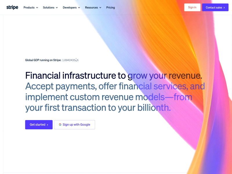
Stripe is the site most often copied and most often copied badly. What people take is the colourful ribbon gradient. What actually makes it work is everything around it: a white background, one headline set in two weights of the same typeface, two buttons, and roughly two-thirds of the screen left alone.
The headline states the product in plain language before any styling gets involved. Read it with the images turned off and it still sells. That is the test worth applying to your own homepage.
What to borrow: a single bold accent — one gradient, one photo, one colour block — against a mostly-empty page. What to skip: the multi-layer scroll effects further down. Those take engineering time most small businesses would rather spend on the booking flow.
2. Linear — dark mode with discipline
Linear is the reference point for dark interfaces done properly. Dark backgrounds are easy to get wrong: pure black plus pure white text produces a glare that is genuinely uncomfortable to read for more than a paragraph. Linear uses a near-black that sits slightly off zero, mutes its body text below full white, and reserves true brightness for the one thing it wants you to click.
The site is also honest about what it is. The navigation is short. The product screenshots are the hero. There is no stock imagery of people pointing at laptops.
What to borrow: if you go dark, soften both ends — lift the background off black, drop the text off white, and keep one high-contrast element as the call to action. What to skip: dark mode entirely, if you sell to a general local audience. It reads as premium to a software crowd and as hard-to-read to a lot of everyone else.
We could not capture a usable screenshot of this one — the page builds its hero after load, so the renderer caught an empty frame. That is itself a signal: heavily client-rendered pages look blank to anything that is not a full browser, including link previews.
3. Herschel Supply Co. — split-screen retail that still sells
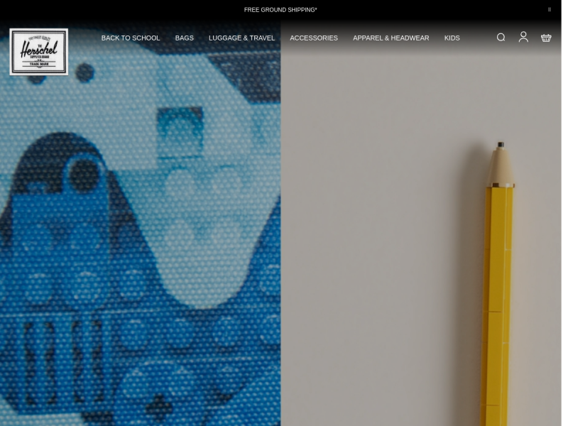
The Vancouver-founded bag brand Herschel Supply Co. runs a layout that most product businesses could adapt directly. Two full-height image panels split the screen, the category menu sits across the top in plain words rather than clever ones, and a thin bar at the very top carries the current promotion.
What is smart here is the restraint in the navigation. Six categories, each named the way a customer would name it. No "Collections", no "Discover", no drop-down maze. If you sell physical products, this is the single most transferable pattern on this list.
What to borrow: plain-language navigation and a promo bar you can update without a developer. What to skip: nothing much, though split-screen layouts need real photography. Two mediocre photos side by side look twice as mediocre.
4. Mailchimp — big type, and one cautionary tale
Mailchimp has one of the most recognisable brand systems on the web: heavy display type, a distinctive yellow, illustration used with actual wit. It belongs on any list of the most creative websites.
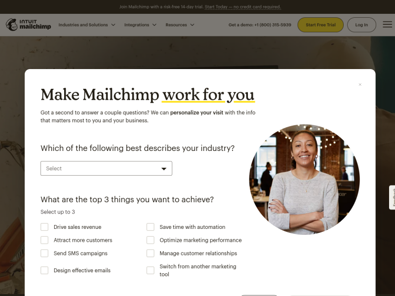
Our screenshot shows something else, though, and it is worth being honest about. On a first, cold visit the page served a full-width personalisation survey that covered the hero almost completely. A company at that scale has tested the trade-off and presumably decided the data is worth it. A small business almost never has that luxury.
What to borrow: confident display type and a brand colour used consistently enough that people recognise it without the logo. What to skip: the interstitial. If a visitor's first interaction with your site is closing something, you have spent your best moment on a pop-up.
The four side by side
| Site | Core idea | Best for | Hardest part to copy |
|---|---|---|---|
| Stripe | One bold accent on a mostly empty page | Service and B2B businesses | The discipline to leave space empty |
| Linear | Dark interface with softened contrast | Software and technical products | Getting the greys right |
| Herschel | Split-screen panels, plain-word navigation | Retail and e-commerce | Photography good enough to fill the screen |
| Mailchimp | Display type and an ownable brand colour | Brands with real personality | Committing to one typeface and sticking to it |
Patterns behind most award-winning websites
Strip away the visual style and the same structural decisions keep showing up across the top business websites, whatever industry they are in:
- The value proposition is the headline. Not a tagline, not a slogan. A sentence a stranger understands.
- The primary action never changes colour. Whatever the button is — Get started, Book, Call — it looks the same every time it appears.
- Proof sits right after the promise. Logos, reviews, a photo of real work. Immediately after the claim, not buried on a separate page.
- Navigation is under seven items. Long menus are a symptom of an unresolved argument about priorities.
- The mobile version is the real version. Most local traffic arrives on a phone, which means the phone layout is the design and the desktop one is the adaptation.
- Speed is treated as a design feature. A beautiful page that takes six seconds is not beautiful to the person who left at four.
Great design is not what you add to the page. It is what you were willing to take off it.
What this costs to build in Alberta
Design inspiration is free. Execution is not, so it helps to know where things land before you fall for a reference site. Our web design pricing is fixed up front, and it looks like this:
- Fast fixed-price build — from $2,500. Usually live in about two weeks. A clean, modern, mobile-first site for a business that needs to look credible and get found.
- Fully custom site — typically $3,000 to $8,000. Custom layouts, original structure, content built around what you actually sell.
- More complex designs — $10,000 to $25,000. Larger sites, custom functionality, integrations, multi-location structures.
- E-commerce — from around $20,000. Full online stores with real product, payment and fulfilment requirements.
Every quote is fixed before work starts. If you want a broader breakdown of what goes into those numbers, we wrote about how much a website costs in detail. And if you would rather see finished work than price bands, our portfolio is the honest version of this article.
When a reference site is the wrong reference
Sometimes the best advice we can give is that a site you admire is a bad model for your business. A gallery layout with enormous imagery is a poor fit for a plumbing company whose customers arrive on mobile with an emergency.
If your customers find you through search and phone calls, structure and speed will outperform styling every time. That is a search problem as much as a design one, and the two need to be solved together. A free SEO audit will tell you which of the two is actually holding you back.
Applying this to a small business site
A practical sequence that works for most local businesses:
- Write the headline first, in plain words, before anyone opens a design tool.
- Choose one visual idea — a colour, a photography style, a typeface — and apply it everywhere.
- Cut the navigation to the five or six things people actually came for.
- Put your proof directly under your promise.
- Design the phone layout first and let the desktop follow.
- Test it on a real phone on a real connection, not on a fast office network.
For examples closer to home, we pulled together a set of small business website examples that trade spectacle for conversion. And if you are weighing local help, we work with businesses across Sylvan Lake, Red Deer and Calgary.
Frequently asked questions
What makes a website design look modern?
Generous space, large confident typography, a single strong visual idea, and a layout built for a phone first. Modern design reads as calm rather than busy. If a page has four things fighting for attention, it will look dated within a year no matter which colours it uses.
Can I just copy a website design I like?
You can copy structure and layout patterns freely — a split-screen hero, a three-column feature row, a sticky call-to-action bar are all common design vocabulary. You cannot copy their photography, illustration, copywriting or logo, all of which are protected. Borrow the skeleton, bring your own skin.
Do award-winning websites actually convert better?
Not automatically. Design awards reward originality and craft, which sometimes pulls in the opposite direction from clarity. Some of the highest-converting sites we have seen are visually unremarkable and ruthlessly clear. Judge a reference site by whether you understood the offer in five seconds, not by whether it won anything.
How many pages does a modern small business website need?
Most local businesses are well served by five to eight pages: a home page, one page per major service, an about page, a proof page, and a contact page. Add pages when you have something specific to rank for.
Should my website use dark mode?
Only if your audience expects it. Dark interfaces suit software, gaming, photography and premium product brands. For most local service businesses a light layout with strong contrast is easier to read and easier to print.
How long does a modern website take to build?
A focused fixed-price build is typically live in about two weeks. Custom projects take longer, and the variable is almost never the design — it is how quickly the content, photography and approvals come together on the client side.
The bottom line
The best modern website design examples are not a style you buy. They are a set of decisions — one message per screen, one visual idea, plain navigation, proof under the promise, and speed treated as part of the design. Stripe, Linear, Herschel and Mailchimp reach very different results from those same rules, and one of them shows what happens when a pop-up gets in the way of good work.
Pick the two patterns most relevant to your business and apply them properly rather than borrowing a little from ten sites. If you would like a straight answer about which of them fits what you sell — and a fixed price to build it — get in touch. If your site is fine and the problem is that nobody is finding it, say so and we will tell you that instead.